Anchor Points
Anchor-Points.RmdBackground
Each output from this package starts with a set of anchor points where the paths begin. This vignette displays the possible variation in anchor points. There are three styles, random, spiral, and diamond. The number of points ranges uniformly from 50 to 1,500. The paths’ starting direction and length determine the color and are generated by simplex noise. The following code examines these pieces individually and puts them together for comparison.
Layout
The first layout style is random. random yields points from a multivariate normal distribution. The standard deviation is the number of points, size, times four divided by the number of digits in size. So for a size of 50 to under 100, the standard deviation is double the size. While for 1,000 and up, it’s just size. This modification tends to balance the images out nicely over a range of values.
The following images display the random anchor point style for a middle size value of 750 and the extremes of 50 and 1,500.
library(flowfieldfigments)
library(tidyverse)
library(scales)
library(mvtnorm)
library(ambient)

# anchor_layout == "random"
set.seed(1)
size <- 750

points <- as.data.frame(mvtnorm::rmvnorm(
  n = size,
  sigma = diag(size * 4 / (floor(log10(size)) + 1),
    nrow = 2
  )
)) %>%
  rename(
    x = V1,
    y = V2
  ) %>%
  mutate(id = row_number())

axes_limits <- max(c(abs(c(
  points$x,
  points$y
))))

ggplot(
  data = points,
  aes(x, y)
) +
  geom_point(size = .5) +
  scale_x_continuous(limits = c(-axes_limits, axes_limits)) +
  scale_y_continuous(limits = c(-axes_limits, axes_limits)) +
  coord_equal() +
  theme_void()
Random 750

Random 50

Random 1500
spiral is the next style. This one follows a spiral based on the golden ratio. Because the output will take up the same space, smaller size values will appear more open while larger size values are denser. Unfortunately, sometimes there is a little hole in the middle depending on cutoffs based on size. However, this is a better result than overcrowding which can happen if there is always a point in the direct center.
# anchor_layout == "spiral"
size <- 750

golden <- ((sqrt(5) + 1) / 2) * (2 * pi)

points <- data.frame(
  x = sqrt(seq(1, size)) * cos(golden * seq(1, size)) * 2.5,
  y = sqrt(seq(1, size)) * sin(golden * seq(1, size)) * 2.5
) %>%
  mutate(id = row_number())

axes_limits <- max(c(abs(c(
  points$x,
  points$y
))))

ggplot(
  data = points,
  aes(x, y)
) +
  geom_point(size = .5) +
  scale_x_continuous(limits = c(-axes_limits, axes_limits)) +
  scale_y_continuous(limits = c(-axes_limits, axes_limits)) +
  coord_equal() +
  theme_void()
Spiral 750

Spiral 50

Spiral 1500
The final layout is diamond. This is a tilted grid with a width of size’s square root. Because the paths’ movements can follow along diagonals, this layout can produce rows of straight lines.
# anchor_layout == "diamond"
size <- 750

grid_width <- ifelse(size <= 1500 / 2, ceiling(sqrt(size)), floor(sqrt(size)))

points <- expand_grid(
  x_start = seq(1, grid_width) - (grid_width / 2) - .5,
  y_start = seq(1, grid_width) - (grid_width / 2) - .5
) %>%
  mutate(
    x = (x_start * cos(45 * pi / 180) - y_start * sin(45 * pi / 180)) * 5,
    y = (x_start * sin(45 * pi / 180) + y_start * cos(45 * pi / 180)) * 5,
    id = row_number()
  ) %>%
  select(-x_start, -y_start)

axes_limits <- max(c(abs(c(
  points$x,
  points$y
))))

ggplot(
  data = points,
  aes(x, y)
) +
  geom_point(size = .5) +
  scale_x_continuous(limits = c(-axes_limits, axes_limits)) +
  scale_y_continuous(limits = c(-axes_limits, axes_limits)) +
  coord_equal() +
  theme_void()
Diamond 750

Diamond 50

Diamond 1500
Color
The color section discusses the paths’ starting direction, as an angle, and length, documented as distance and percentage. These values specify the final color. Because these values get generated before the paths, they can be thought of as points’ attributes.
The initial angle for the paths determines the hue. The following code example starts with two directional values (x_direction and y_direction), standardizes them to a unit vector, and finally uses atan2 to get the angle. This example sets up for later code when the directional vectors are drawn from noise, but the rest of the procedure is the same.
There is a randomly generated value for hue_turn that rotates the colors. This way, the colors can end up pointing in any direction. For these examples, this variable is set to zero, so they all follow the traditional hue values.
seeds <- sample(1:10000, 3)
hue_turn <- 0

angle_data <- expand_grid(
  x_direction = seq(-1, 1, by = .5),
  y_direction = seq(-1, 1, by = .5)
) %>%
  mutate(vector_length = sqrt(x_direction^2 + y_direction^2)) %>%
  mutate(
    x_direction = x_direction / vector_length,
    y_direction = y_direction / vector_length
  ) %>%
  select(-vector_length) %>%
  mutate(angle = (atan2(y_direction, x_direction) * 180 / pi) %% 360 + hue_turn) %>%
  filter(!is.na(angle)) %>%
  distinct() %>%
  mutate(
    x = cos(angle * pi / 180),
    y = sin(angle * pi / 180),
    label_text = paste0(
      "x_direction = ", round(x_direction, 3),
      ",\n y_direction = ", round(y_direction, 3)
    ),
    hjust = if_else(x >= 0, -.15, 1.15),
    vjust = if_else(y >= 0, -.05, 1.05),
    text_angle = if_else(x >= 0, angle, angle + 180)
  ) %>%
  mutate(vjust = if_else(angle %in% c(0, 90, 180, 270), .5, vjust))

# basically just running around the unit circle
ggplot(
  data = angle_data,
  aes(
    x = x,
    y = y,
    color = angle,
    label = label_text,
    hjust = hjust,
    vjust = vjust,
    angle = text_angle
  )
) +
  geom_point() +
  geom_text(size = 1.25) +
  scale_x_continuous(limits = c(-2.5, 2.5)) +
  scale_y_continuous(limits = c(-2.5, 2.5)) +
  coord_equal() +
  theme(
    text = element_text(size = 7.5),
    legend.key.size = unit(.25, "cm")
  )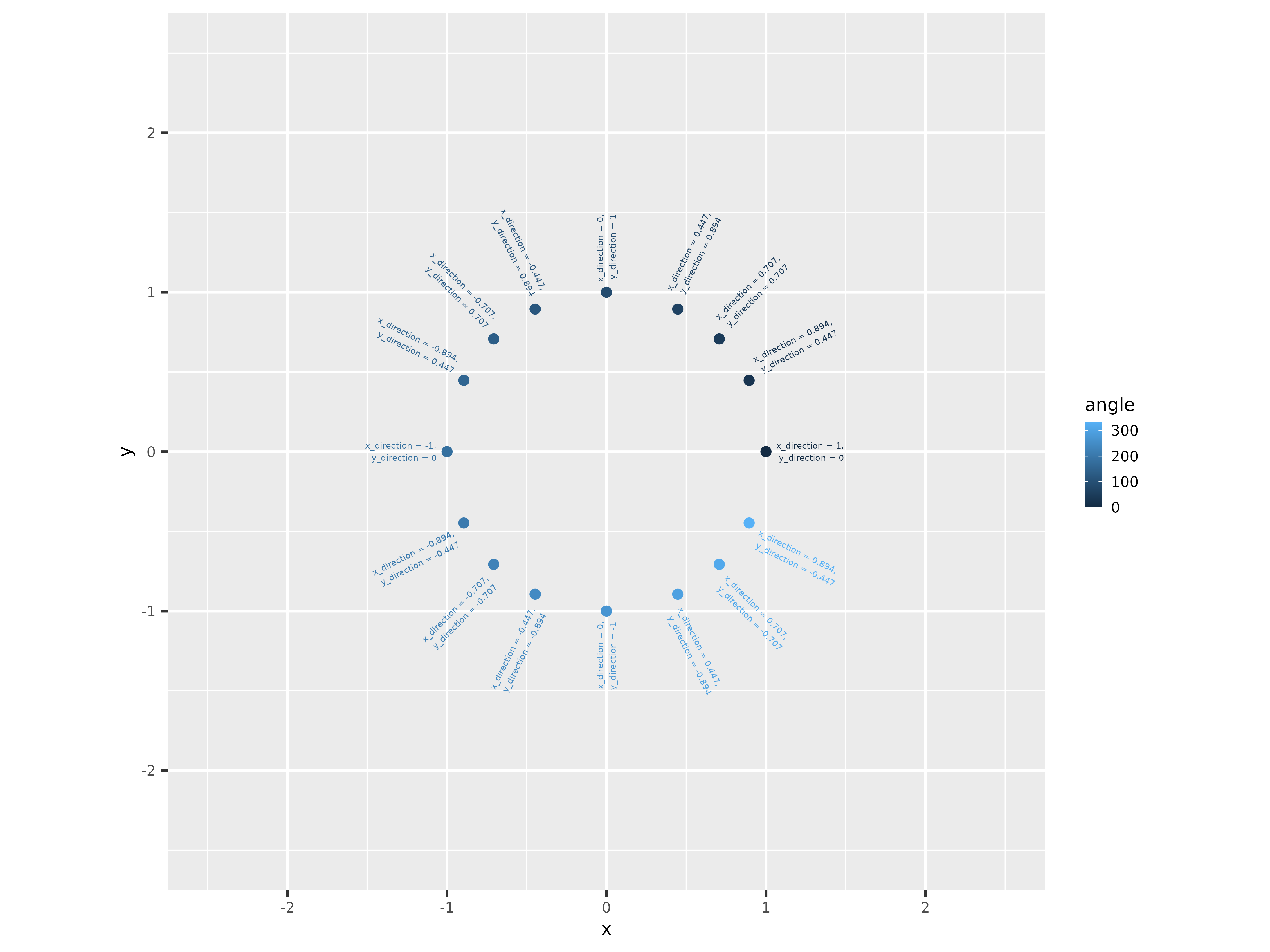
Angle Data
The distance value determines the chroma. The code will need a parameter from 0 to 100, but the data mostly range symmetrically around 0, possibly from -2 to 2. Using the standard deviation of the data, the pnorm function can convert these values to be between 0 and 1. Then multiplying by 100 spreads it across the acceptable range. Of course, different effects will come from different distributions, but this one works out nicely. (Also, it’s not precisely the chroma value because the color scheme is at an angle and maxes out at 63. See the color scheme vignette.)
distance_data <- data.frame(
  distance_1 = rnorm(1000),
  distance_2 = runif(1000, -1, 1),
  distance_3 = c(rnorm(500), runif(500, -1, 1))
) %>%
  mutate(
    distance_1 = pnorm(distance_1, 0, sd = sd(distance_1)) * 100,
    distance_2 = pnorm(distance_2, 0, sd = sd(distance_2)) * 100,
    distance_3 = pnorm(distance_3, 0, sd = sd(distance_3)) * 100
  )
ggplot(
  data = distance_data,
  aes(x = distance_1)
) +
  geom_histogram(bins = 25)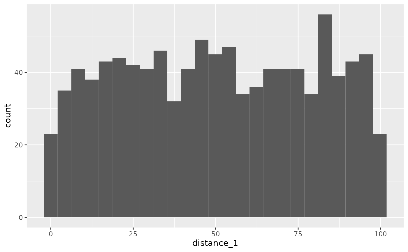
Distance 1
ggplot(
  data = distance_data,
  aes(x = distance_2)
) +
  geom_histogram(bins = 25)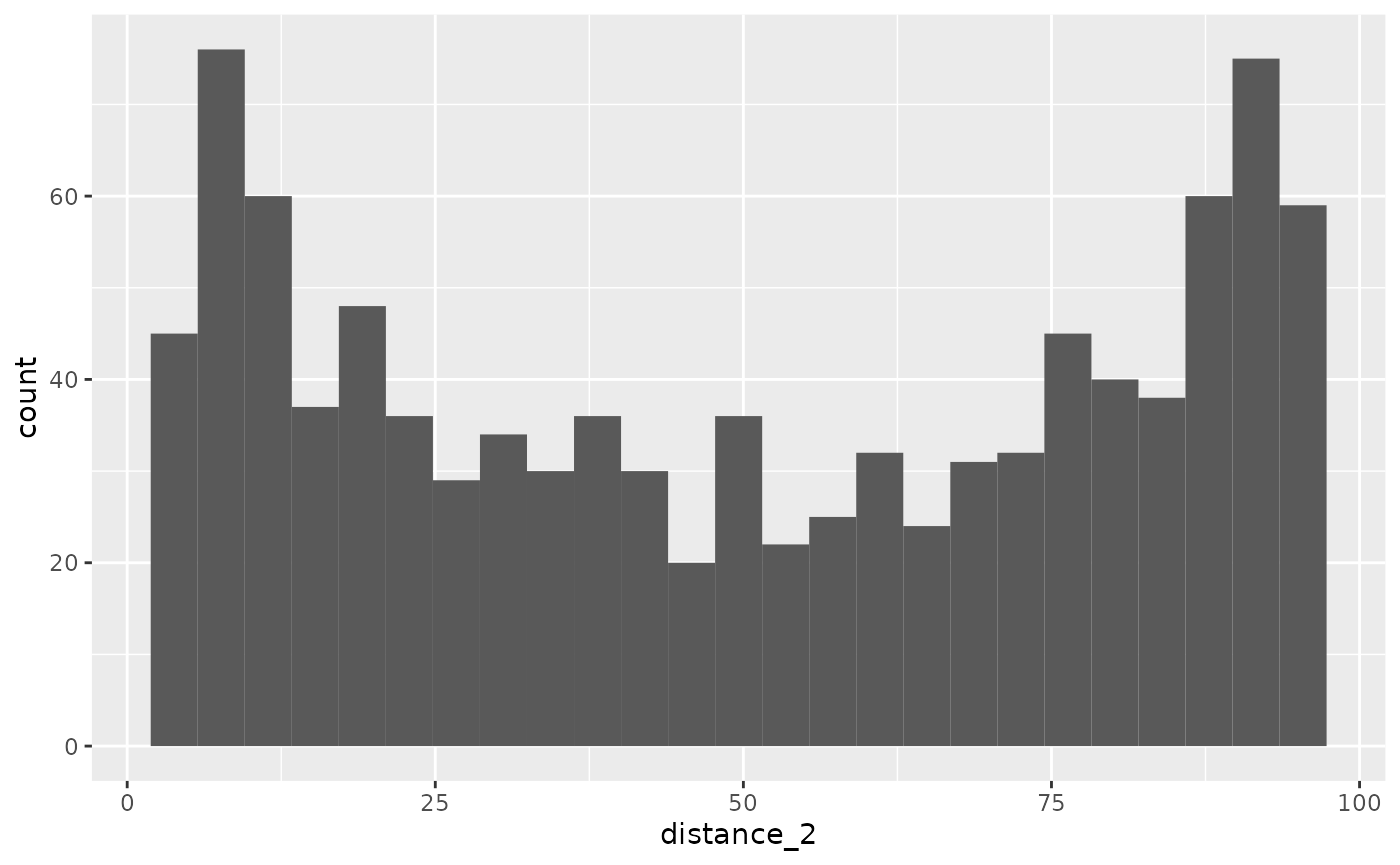
Distance 2
ggplot(
  data = distance_data,
  aes(x = distance_3)
) +
  geom_histogram(bins = 25)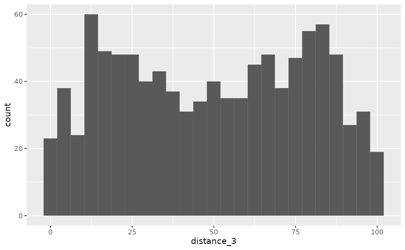
Distance 3
Now that the angle and distance examples are set, the actual code can be investigated. The get_vectors function will generate the paths from simplex noise and is used here for the initial angle. Notice the familiar code with x_direction and y_direction.
get_vectors <- function(points, seeds) {
  vectors <- points %>%
    mutate(
      x_direction = gen_simplex(x,
        y,
        frequency = .01,
        seed = seeds[1]
      ),
      y_direction = gen_simplex(x,
        y,
        frequency = .01,
        seed = seeds[2]
      )
    ) %>%
    mutate(vector_length = sqrt(x_direction^2 + y_direction^2)) %>%
    mutate(
      x_direction = x_direction / vector_length,
      y_direction = y_direction / vector_length
    ) %>%
    select(-vector_length)
}
We will use the diamond layout with a size of 750 to set the anchor points. The get_vectors function uses this dataset, generates the initial direction and distance, calculates the angle and percentage, then gets the color. We can pull the result apart in the following sections.
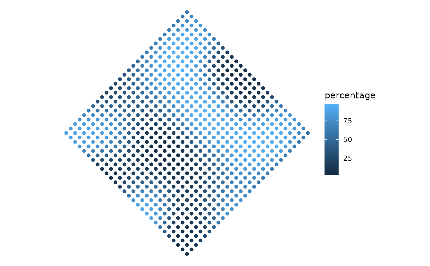
size <- 750

grid_width <- ifelse(size <= 1500 / 2, ceiling(sqrt(size)), floor(sqrt(size)))

points <- expand_grid(
  x_start = seq(1, grid_width) - (grid_width / 2) - .5,
  y_start = seq(1, grid_width) - (grid_width / 2) - .5
) %>%
  mutate(
    x = (x_start * cos(45 * pi / 180) - y_start * sin(45 * pi / 180)) * 5,
    y = (x_start * sin(45 * pi / 180) + y_start * cos(45 * pi / 180)) * 5,
    id = row_number()
  ) %>%
  select(-x_start, -y_start)

points <- get_vectors(points, seeds) %>%
  mutate(distance = gen_simplex(points$x,
    points$y,
    frequency = .01,
    seed = seeds[3]
  )) %>%
  mutate(
    angle = (atan2(y_direction, x_direction) * 180 / pi) %% 360 + hue_turn,
    percentage = pnorm(distance, mean = 0, sd = sd(distance)) * 100
  ) %>%
  rowwise() %>%
  mutate(hex_color = flowfieldfigments::get_color(angle, percentage)) %>%
  ungroup() %>%
  mutate(
    x_color = percentage * cos(angle * pi / 180),
    y_color = percentage * sin(angle * pi / 180),
    time = 0
  ) %>%
  filter(!is.na(hex_color))

axes_limits <- max(c(abs(c(
  points$x,
  points$y
))))

ggplot(
  data = points,
  aes(x, y, color = hex_color)
) +
  geom_point(size = .5) +
  scale_color_identity() +
  scale_x_continuous(limits = c(-axes_limits, axes_limits)) +
  scale_y_continuous(limits = c(-axes_limits, axes_limits)) +
  coord_equal() +
  theme_void()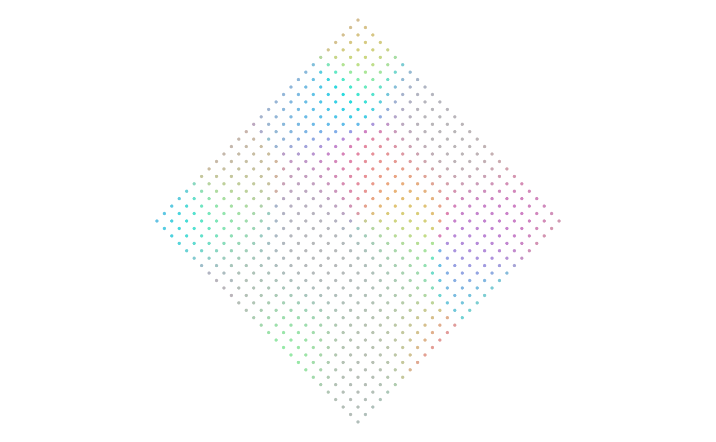
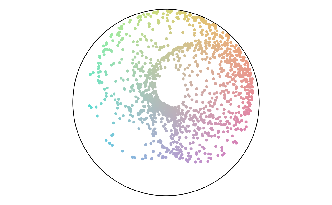
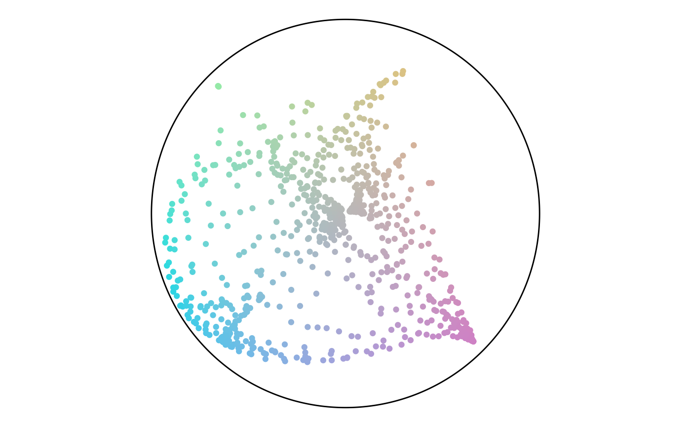
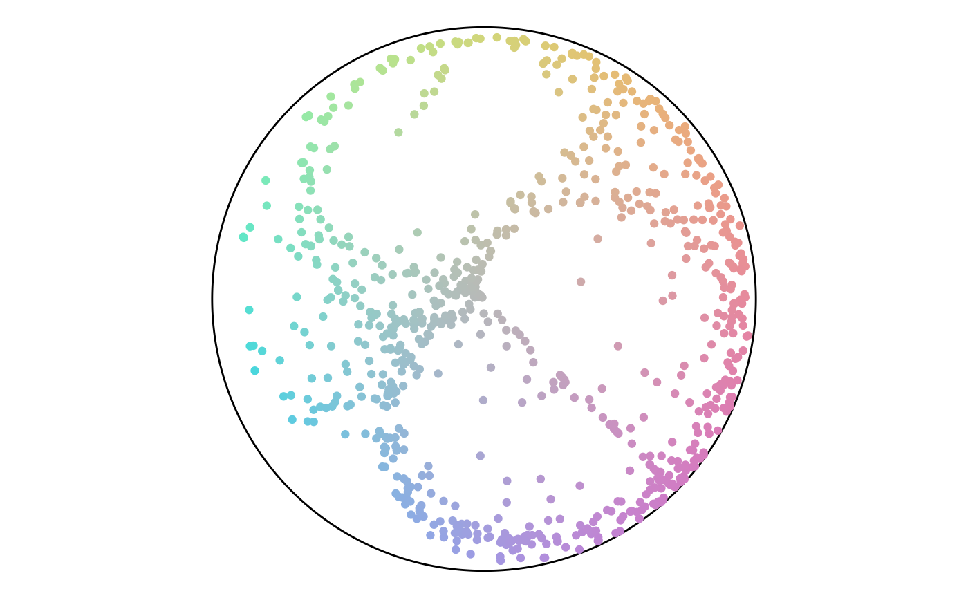
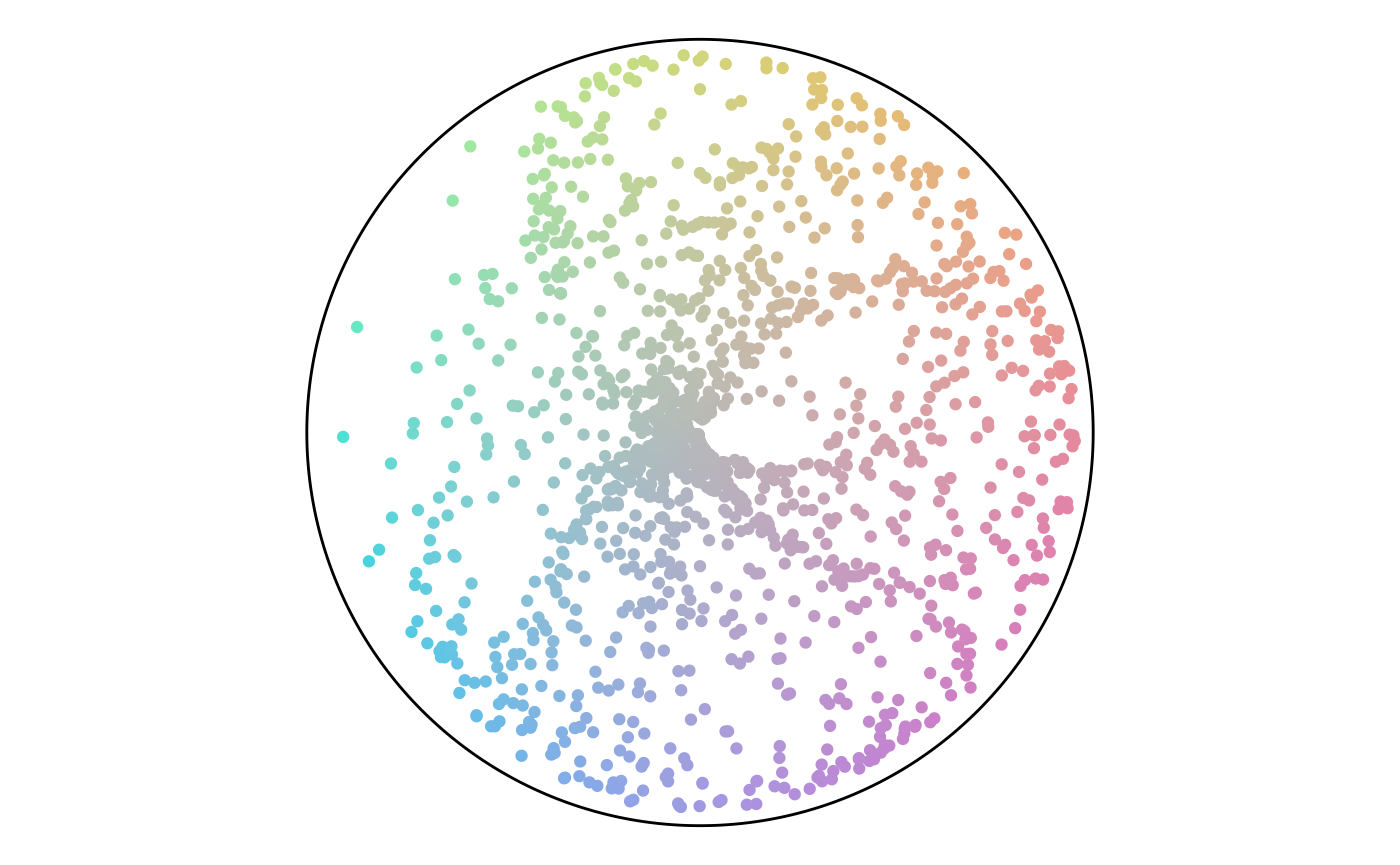
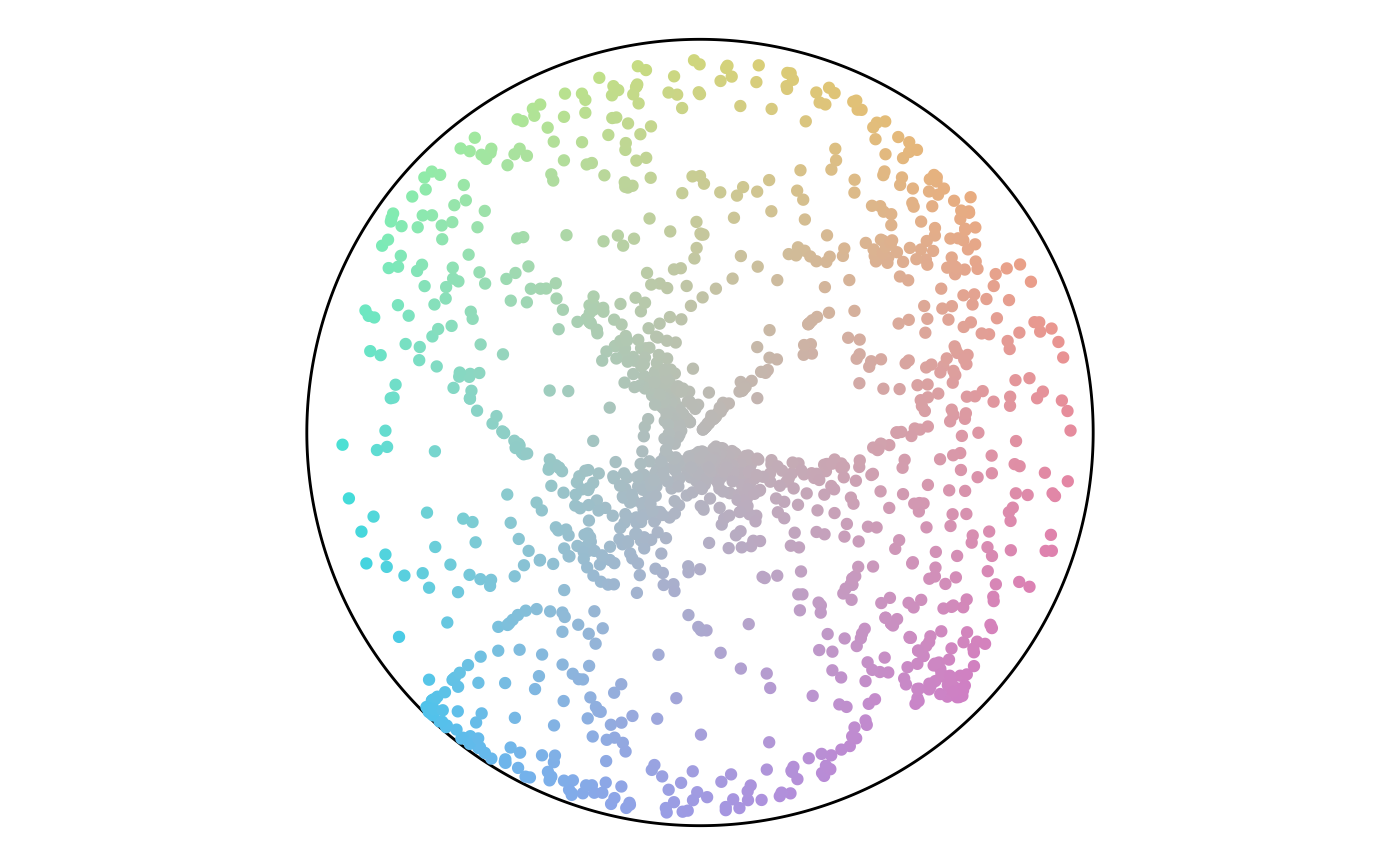
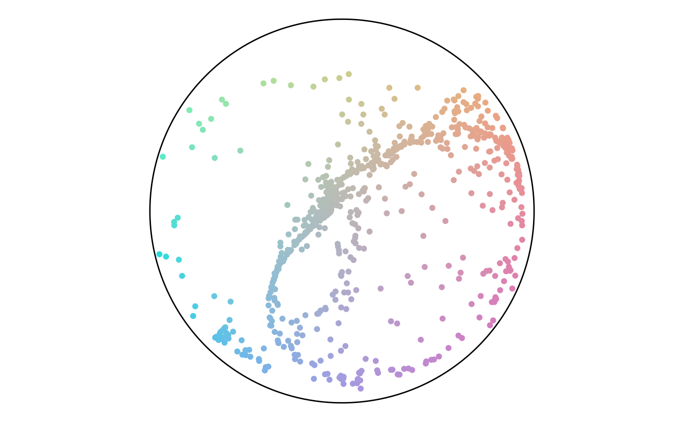
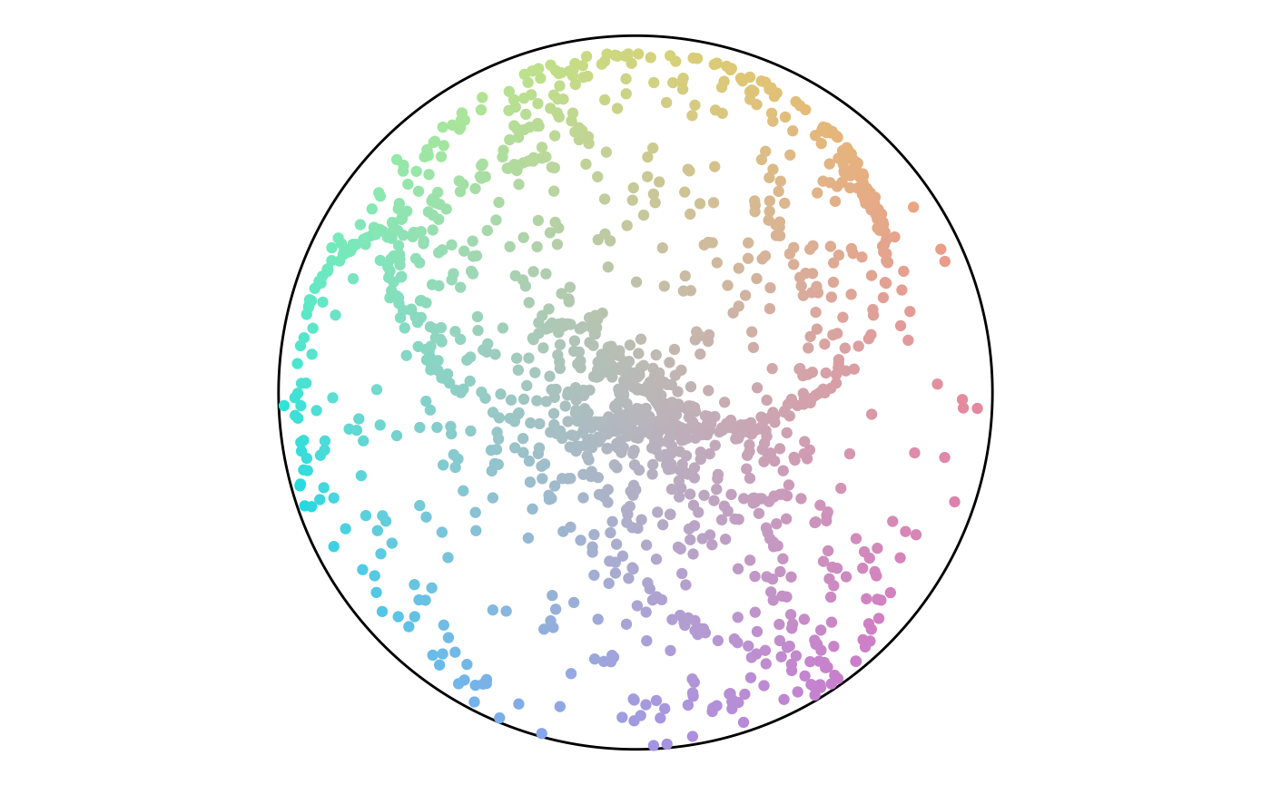
Point Attributes
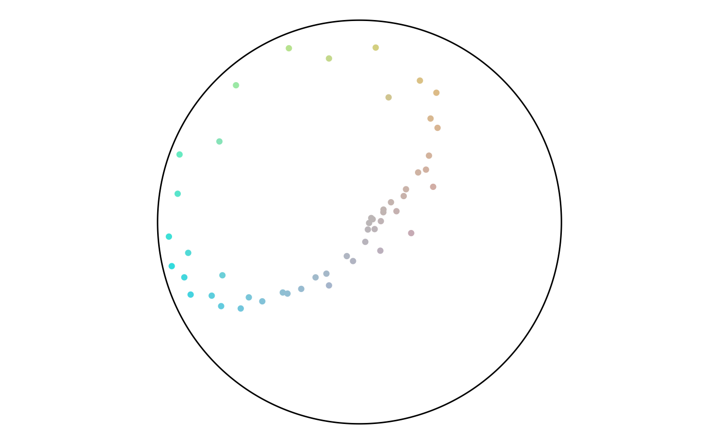
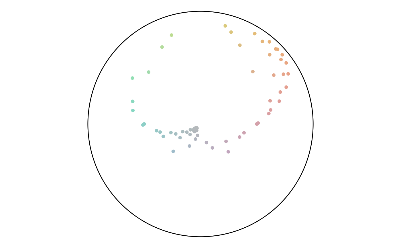
From here, we can analyze the angle values. An angle of 135 is common, while values from 0 to 45 are not. The colors show this with a large green region and very little red.
ggplot(
  data = points,
  aes(x = angle)
) +
  geom_histogram(bins = 36) +
  scale_x_continuous(
    limits = c(0, 360),
    oob = scales::oob_keep,
    breaks = seq(0, 360, 45)
  ) +
  coord_polar(
    direction = -1,
    start = 270 * pi / 180
  )
colors <- data.frame(angle = seq(0, 360, 30)) %>%
  rowwise() %>%
  mutate(color =
           flowfieldfigments::get_color(
             angle, 100)) %>%
  pull(color)

ggplot(
  data = points,
  aes(x, y, color = angle)
) +
  geom_point() +
  scale_x_continuous(limits = c(-axes_limits,
                                axes_limits)) +
  scale_y_continuous(limits = c(-axes_limits,
                                axes_limits)) +
  coord_equal() +
  theme_void() +
  scale_colour_gradientn(
    colors = colors,
    breaks = seq(0, 360, 45)
  )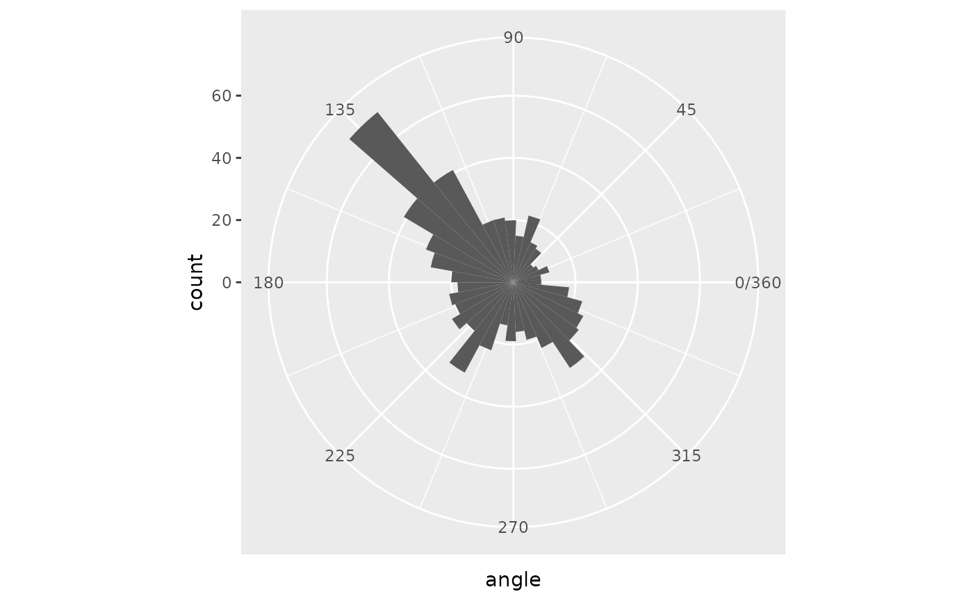
Angle Histogram
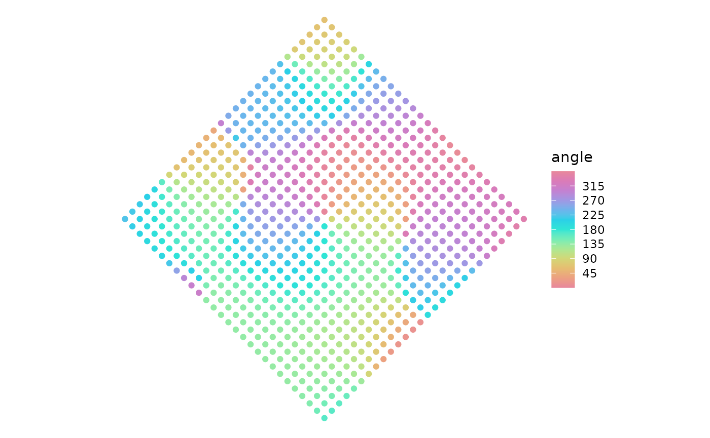
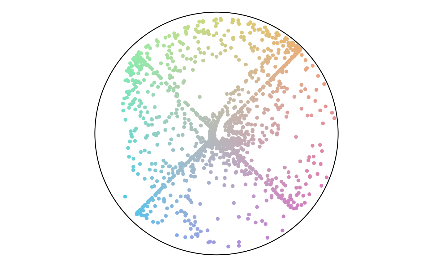
Angle Map
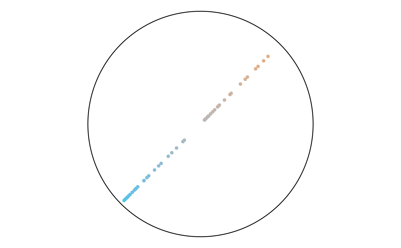
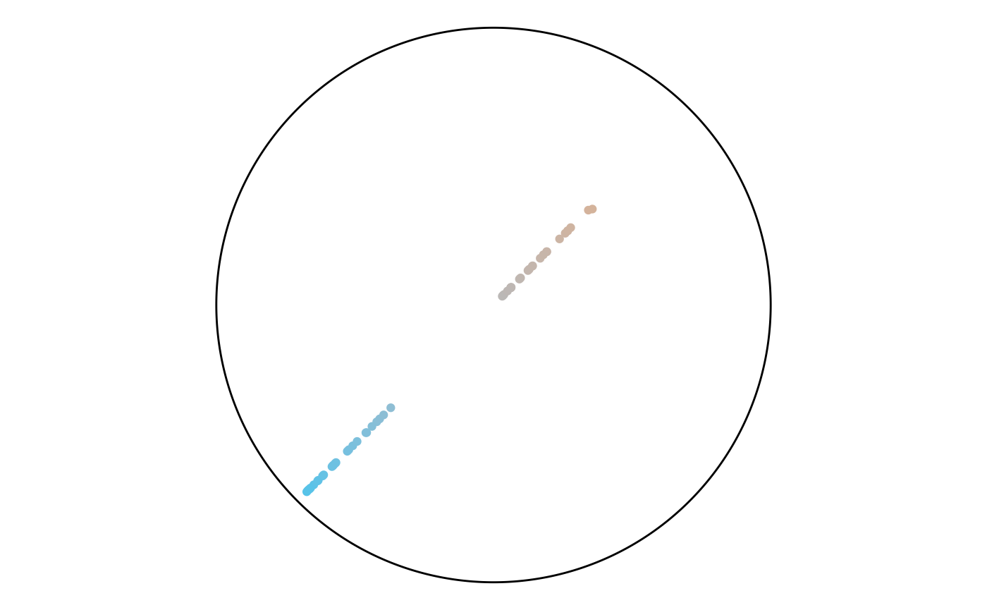
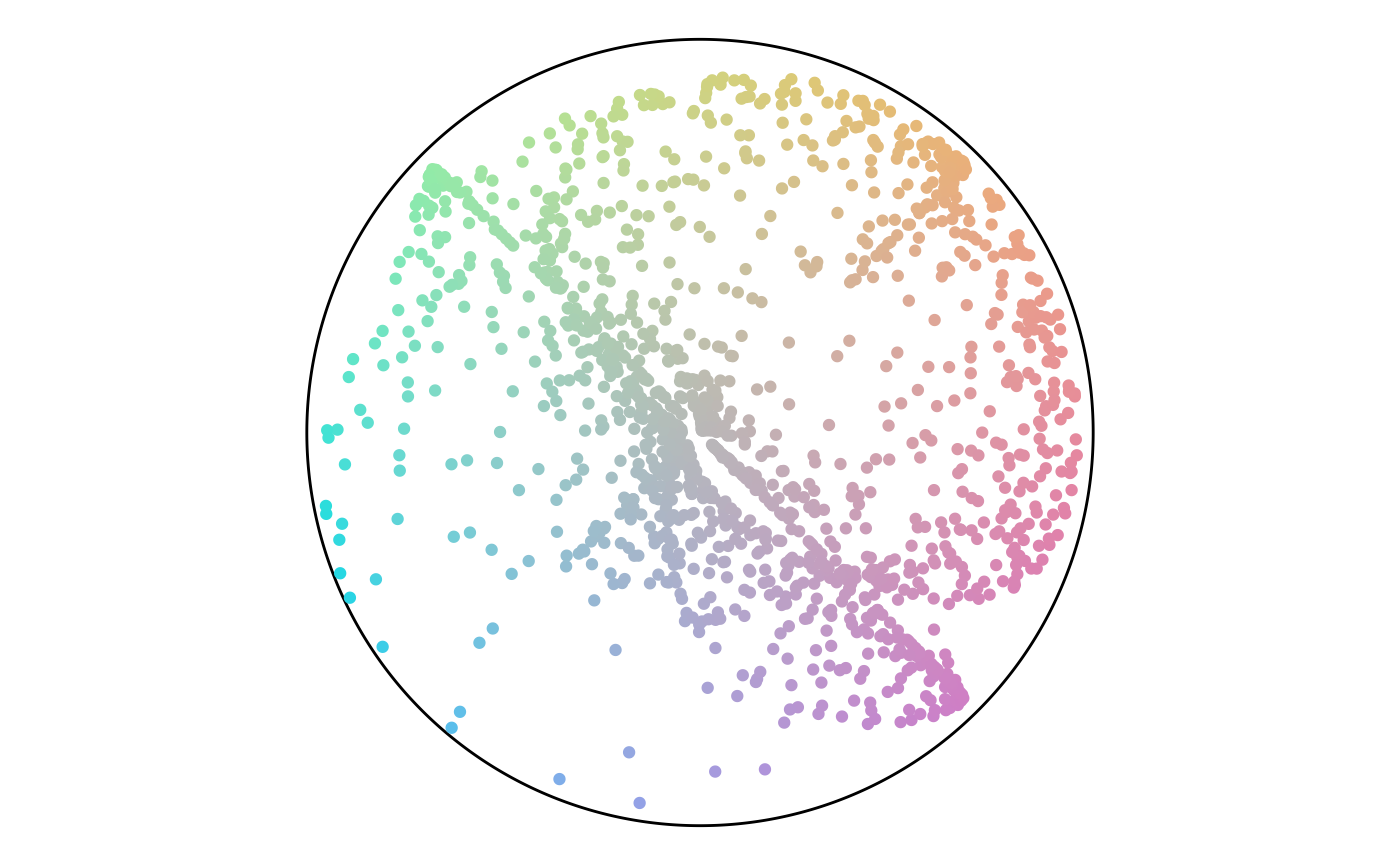
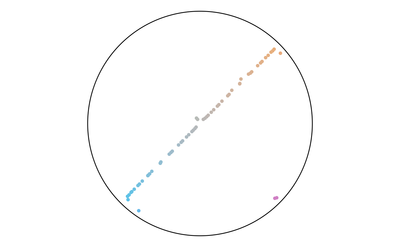
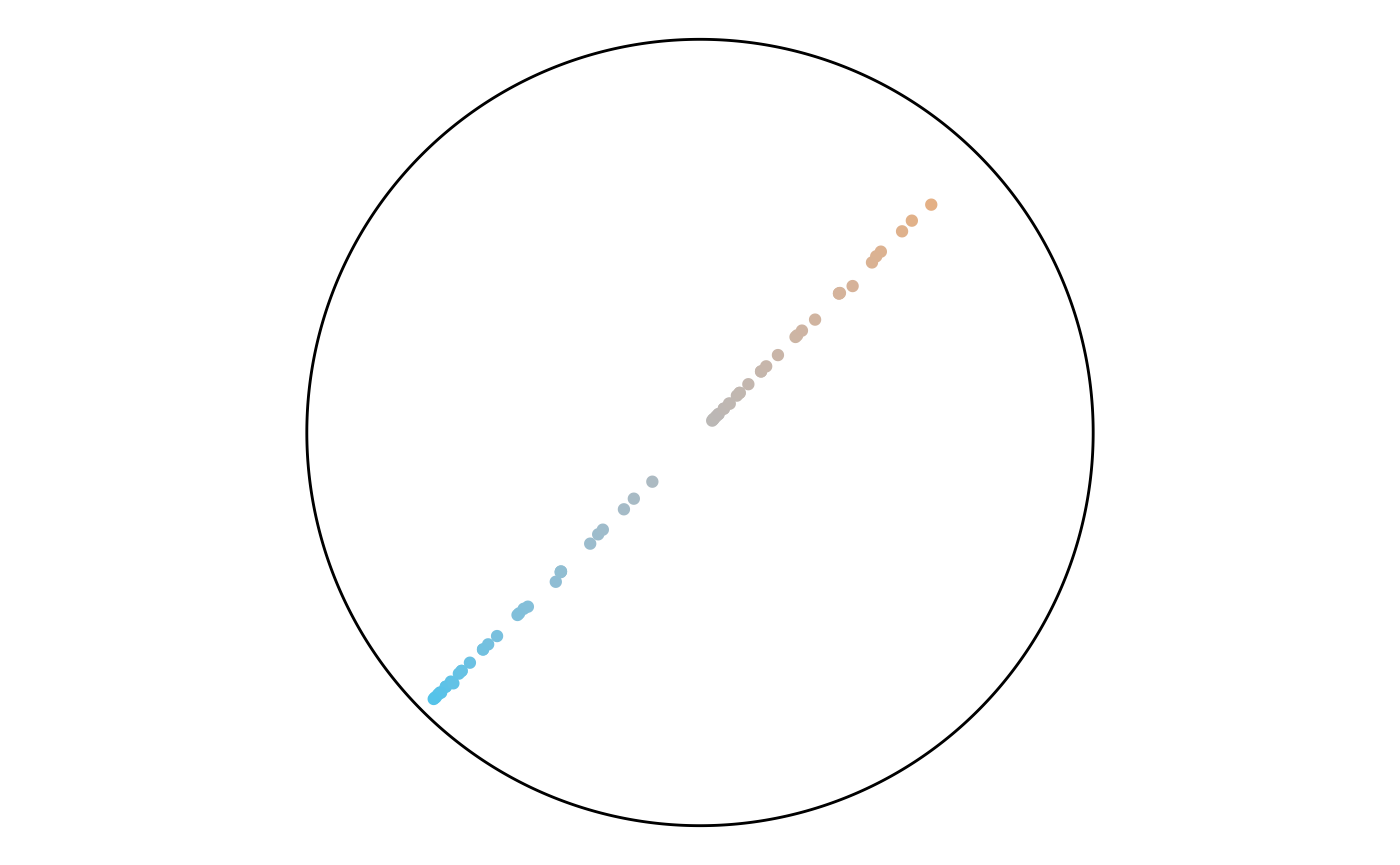
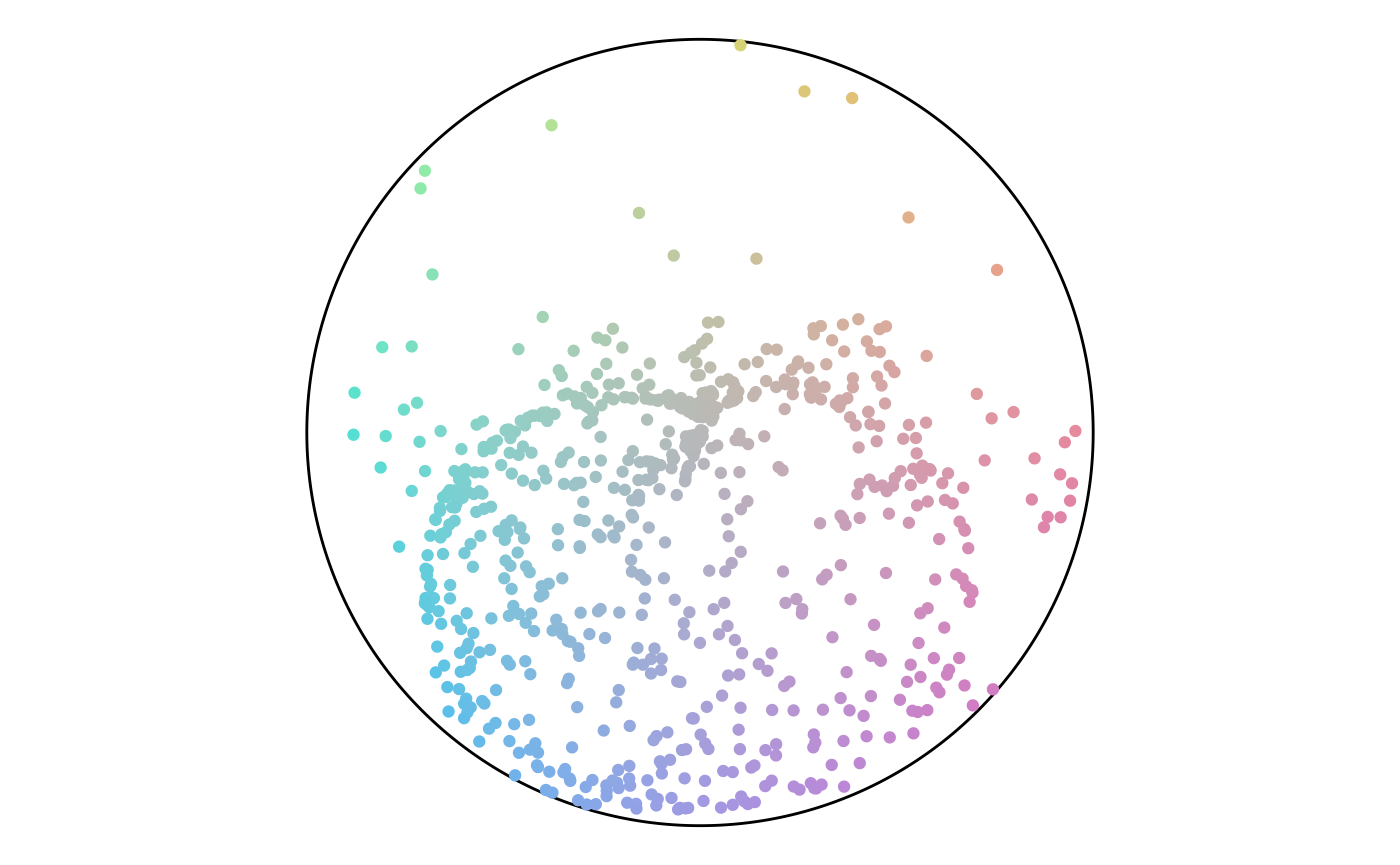
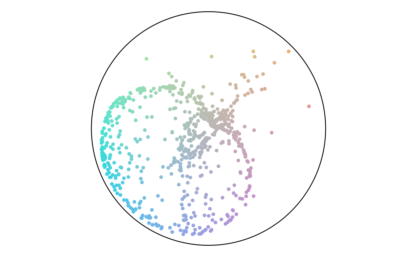
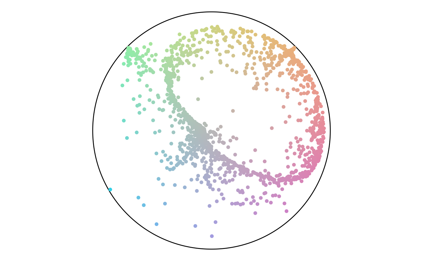
The distance values range from -1 to 1 for this pull. Notice that the highlights from the distance map do not match any specific region of the earlier angle map. These values are unconnected. The percentage values, however, are a function of the distance values. So, a strong match between the two maps exists.
ggplot(
  data = points,
  aes(x = distance)
) +
  geom_histogram(bins = 25)
ggplot(
  data = points,
  aes(x, y, color = distance)
) +
  geom_point() +
  scale_x_continuous(limits = c(-axes_limits,
                                axes_limits)) +
  scale_y_continuous(limits = c(-axes_limits,
                                axes_limits)) +
  coord_equal() +
  theme_void()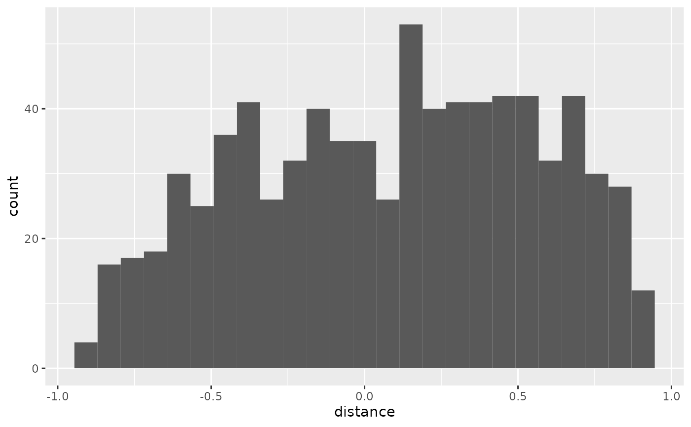
Distance Histogram
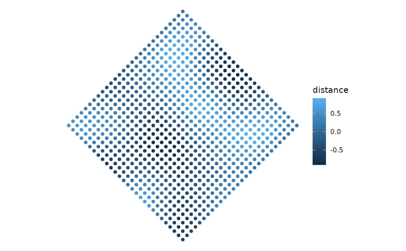
Distance Map
ggplot(
  data = points,
  aes(x = percentage)
) +
  geom_histogram(bins = 25)
ggplot(
  data = points,
  aes(x, y, color = percentage)
) +
  geom_point() +
  scale_x_continuous(limits = c(-axes_limits,
                                axes_limits)) +
  scale_y_continuous(limits = c(-axes_limits,
                                axes_limits)) +
  coord_equal() +
  theme_void()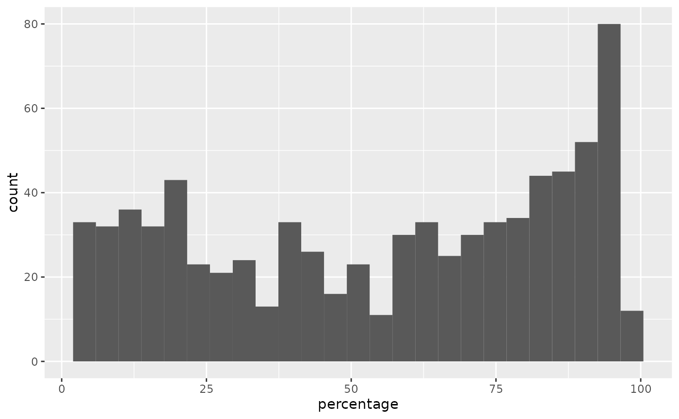
Percentage Histogram
Percentage Map
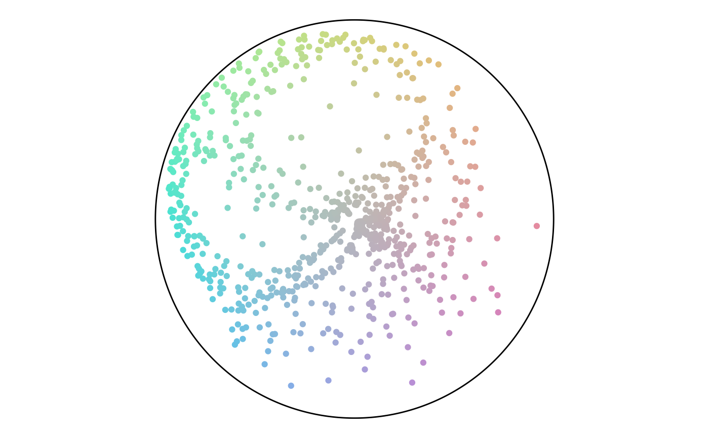
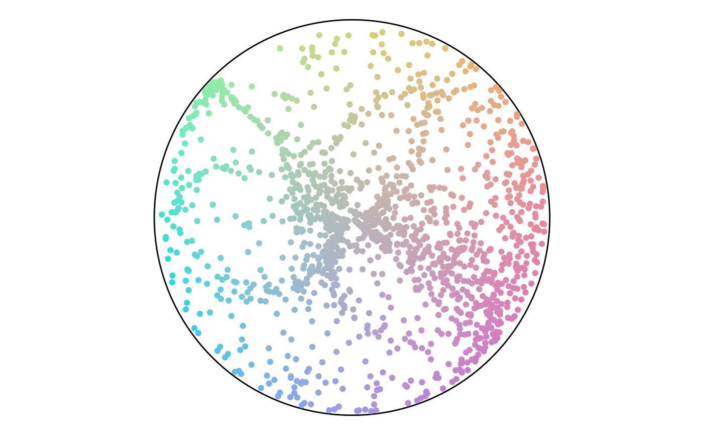
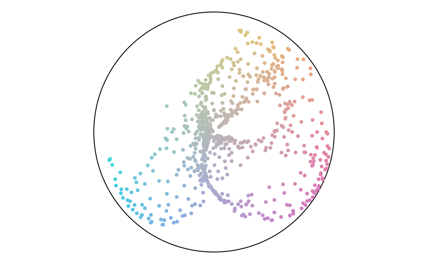
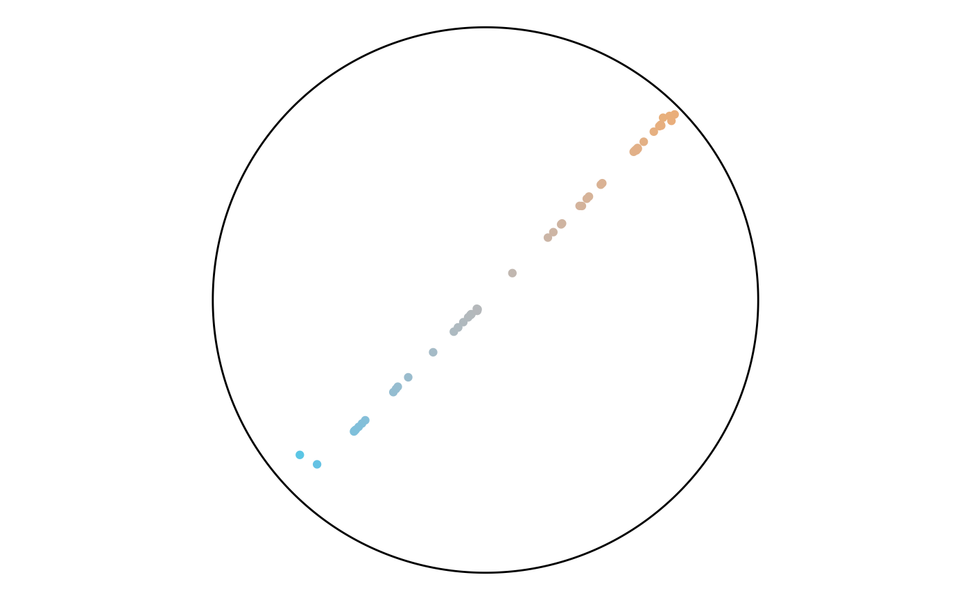
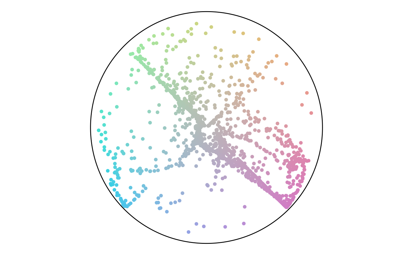
Finally, we can plot both angle and percentage from the points to see where they fall on the color scheme. This plot shows that while there are a lot of points in the green hue, a lot of them have a low percentage value and end up gray. This result matches the plot of the point attributes.
circle <- data.frame(value = c(seq(0, 360, .5), 0)) %>%
  mutate(x = 100 * cos(value * pi/180),
         y = 100 * sin(value * pi/180))

ggplot() +
  geom_polygon(data = circle,
               aes(x, y),
               color = "black",
               fill = "NA") +
  geom_point(data = points,
             aes(x_color, y_color, color = hex_color)) +
  scale_color_identity() +
  coord_equal() +
  theme_void()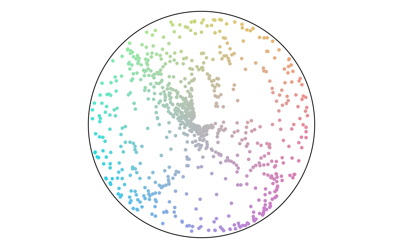
Points in the Color Scheme
Results comparison
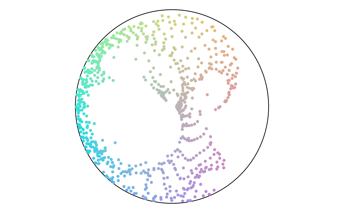
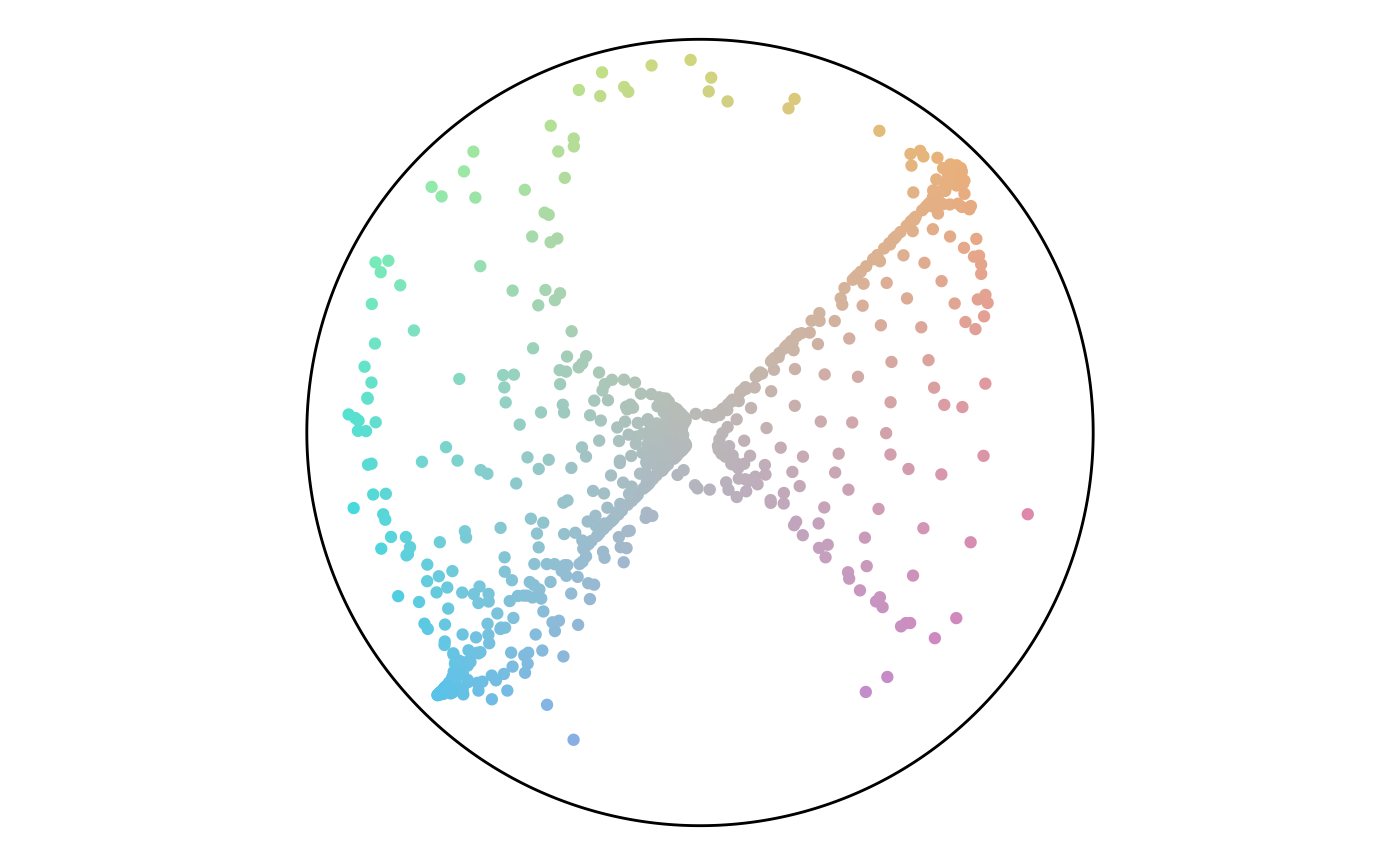
The final section runs the previous code for different anchor layouts and sizes. For each set, the rows have size of 50, 750, and 1,500. There’s a trend of angles following along the diagonals or flowing in loops. There are not any noteworthy differences between layout styles.
Random
set.seed(2)
set.seed(3)
set.seed(4)
set.seed(5)
set.seed(6)
set.seed(7)
set.seed(8)
set.seed(9)
set.seed(10)